

For garden and courtyard lighting, start by choosing the appearance you want, then compare actual samples in the same setting. Around 3000K is commonly described as warm white, 4000K as neutral white and 6000K as cool white. These categories describe light colour, not how much light reaches a path or how comfortable a fixture will be to look at.
When comparing warm white vs cool white outdoor lights, consider the entrance, seating area, materials and other visible fixtures together. A consistent, well-positioned selection is often a more useful starting point than choosing the highest or lowest colour-temperature number in isolation.
Separate Colour Temperature, Brightness and Colour Rendering
Three different questions
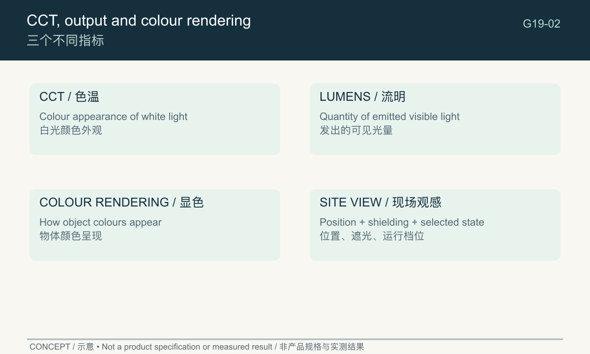
Correlated colour temperature, or CCT, summarises the colour appearance of a white light source. Lumens describe emitted light quantity. Colour rendering concerns how objects appear under that light. One number does not answer all three questions.
The US Department of Energy distinguishes the appearance of the light itself from its effect on object colours in its LED light-quality explanation. This is why selecting a Kelvin value alone does not fully specify the visual result.
Avoid a common purchasing shortcut
A buyer may describe a cool-white sample as “brighter” because of its appearance. That observation can be useful, but it should not be converted into a claim that its CCT proves higher lumens or better path illumination.
Similarly, a warm-white fixture can have an uncomfortable visible source. Colour choice does not remove the need to check shielding, position and the actual operating level. Keep the colour discussion connected to a complete fixture rather than an isolated LED label.
Record CCT, output state and any declared colour-rendering information separately. Where a field is missing, ask for it if it matters to the project. Do not infer a high colour-rendering value from a pleasing promotional photograph.
Compare Warm, Neutral and Cool White
The three categories below are a practical comparison vocabulary. Boundaries and descriptions can vary between suppliers, so place the actual Kelvin value and supplied option in the order.
What 3000K, 4000K and 6000K can look like
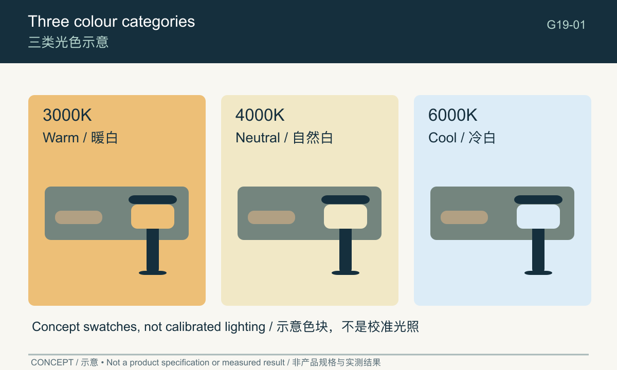
A 3000K candidate usually appears warmer or more yellow-toned than a 4000K candidate viewed under comparable conditions. A 6000K candidate usually appears cooler relative to both. Surrounding materials, other light sources and visual adaptation influence the impression.
The comparison image uses colour swatches and a repeated simplified scene. It is not a calibrated rendering, a photograph of three tested products or evidence of equal light output. Your display can also change its appearance.
| Category | Useful starting question | What still needs checking |
|---|---|---|
| Warm white, around 3000K | Does this suit the intended seating and material palette? | Output, source visibility and actual colour match |
| Neutral white, around 4000K | Does this coordinate with the entrance and surrounding lighting? | Appearance on walls, plants and faces |
| Cool white, around 6000K | Is the cooler appearance intentional and compatible with the site? | Contrast with adjacent warm sources and comfort |
| Mixed categories | Are the areas visually separate or deliberately contrasted? | Whether the combination looks planned in shared views |
These are trial prompts, not rules that assign a mandatory colour to each task. A garden’s materials and existing lighting may justify a different choice from the first candidate.
Do not compare photographs as if they were samples
Phone cameras often adjust white balance automatically. Two photographs taken separately can conceal a real difference or exaggerate one. Editing, screen settings and ambient viewing light add further uncertainty.
Use product images to identify the fixture and understand its form. For a colour decision, compare the actual candidates under controlled, recorded conditions, then confirm the selected option with the supplier.
Choose for Entrances, Paths and Seating Areas
Start with the areas seen together
At an entrance, review the door, gate, handle and adjoining wall under the candidate light. Consider what existing interior or exterior light is visible at the same time. A new fixture that contrasts strongly may look intentional, or it may appear mismatched.
Along a path, compare how the chosen colour relates to paving and planting. Do not let the colour discussion replace the question of whether the route and level changes can be recognised.
At a seating area, view the fixture from the actual chair position. A warm-white candidate is a reasonable first trial where that appearance is desired, but its location and emitting surface still determine whether it dominates the view.
Can wall and pathway lights match?
They can be coordinated, but matching catalogue labels are only the start. Compare the proposed wall and path samples together, in their intended modes, rather than approving each in a different room or on a different day.
The solar bollard light range provides candidate low-level forms, while solar wall lights serve different mounting positions. Check the actual colour options for each selected model; do not assume that every family offers the same choices.
If only one fixture is being replaced, bring the surviving fixture into the comparison. Its current appearance may differ from the original order label, and the visible mismatch is what the site review needs to address.
Check Sightlines and Shielding
Colour temperature does not describe how much of the emitting surface a person sees. Review the source from the entrance, path, seat and relevant windows. A comfortable result depends on the fixture and its position as well as the selected colour.
Look at the source and the illuminated surfaces
First inspect the route and objects the light serves. Then look towards the fixture from normal viewpoints. If the source is the dominant feature, try a supported positional or fixture change rather than assuming a warmer option alone will solve it.
Include both background and triggered states where the product has them. A wall light may look coordinated at its lower state but become conspicuous when triggered. That is a control and sightline issue as well as a colour comparison.
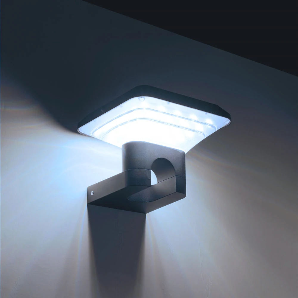
Include indoor views
A garden can look balanced from its centre yet show a distracting source from the house. Review the view through the windows people actually use. Consider curtains and normal indoor lighting without assuming that one staged photograph represents everyday conditions.
For the wider arrangement of entrance, path and seating fixtures, use the yard lighting guide. Colour works best as part of that arrangement, not as a late attempt to make unrelated positions feel coordinated.
Keep Adjacent Fixtures Visually Consistent
Agree what “matching” means
For a group order, record the selected CCT option, product version, sample reference and any supplier-declared colour consistency information. Ask whether the supplied group will follow the agreed sample selection.
Do not promise a perfect match solely because two products say 3000K. CCT compresses colour information into one value; the light sources and complete fixtures can still look different. Where the fixtures are seen side by side, direct comparison is particularly useful.
This matters when adding a second phase later. Preserve the earlier order and sample records, but still compare new candidates with the installed group. A repeated label does not remove the need to inspect the actual result.
Decide whether a mixed scheme is deliberate
A cooler service area and a warmer seating area can be considered separately if the arrangement supports that distinction. In a small courtyard where both are always visible, test whether the contrast feels purposeful.
Document the exception on the plan. “P4 intentionally uses a different colour category” is clearer than an unexplained mismatch discovered after delivery. If there is no clear reason for the difference, start by comparing a coordinated group.
Confirm Samples and Order Options
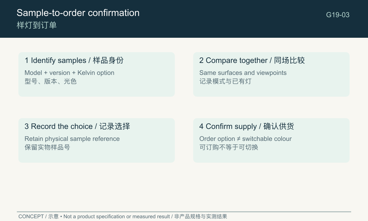
Use a simple sample confirmation table
The SLL-002 product page is a relevant route to a bollard family. Confirm the actual colour option for the supplied configuration; a list of order options does not mean the installed product can switch between them.
| Field | Record |
|---|---|
| Candidate identity | Model, version and sample number |
| Colour option | Stated Kelvin value and supplier option code |
| Control state | Mode and level used for the comparison |
| Comparison location | Entrance, path, seating and relevant window views |
| Surfaces viewed | Paving, wall, plants and other relevant objects |
| Existing lighting | Which nearby lights were operating |
| Result | Retain, reject or compare another candidate, with reason |
| Order confirmation | Selected option, matching requirement and whether adjustment is supported |
Keep the comparison fair
Ask the reviewer to describe the difference before naming a preferred option. Notes such as “the wall looks noticeably cooler than the entrance” or “the source is too prominent from this chair” separate colour mismatch from placement. If the objection concerns the visible source rather than the illuminated surfaces, test that issue directly. This avoids changing the entire colour schedule to solve a local sightline problem.
Place samples so that their roles can be compared safely, using supported arrangements. Observe the same surfaces and viewpoints. If modes or output levels differ, record that difference instead of attributing every visual change to CCT.
Keep photographs as supporting records, preferably with consistent camera settings where practical. The final approval should identify the physical sample and configuration, not just an image file named “warm”.
Send the selected sample reference, colour option and grouped fixture list with the order enquiry. That makes matching light colour a concrete supply question rather than a vague request for “a pleasant garden effect”.
Frequently asked questions
Is warm white or cool white better for a garden?
Choose through the intended appearance, shared views and actual samples. Neither category guarantees better illumination or comfort.
Can I change the colour after purchase?
Only if the exact model supports adjustment and the instructions describe it. A product available in several factory options may still have a fixed colour when supplied.
What should I check before approving a sample?
Its identity, selected mode, colour on relevant surfaces, direct source visibility and relationship to the other fixtures. Record the order option that reproduces the approved choice.
For an overview of fixture types, site conditions and selection priorities, see our garden and courtyard lighting guide.